Sankey diagram example data and code
news
code
analysis
network
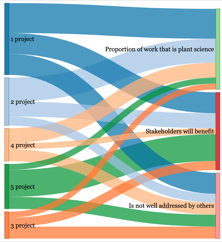
I first learned about a Sankey graph from Tufte’s data visualization book (Tufte 1983). It is a heartbreaking image of Napoleon’s army’s attempt to invade Moscow, but instead of victory, thousands died through a mix of war and unhygienic and freezing weather as the marched to Moscow and back to France. My purposes for this post are much more mundane, quite unimportant relatively - to look at weightings of a project with criteria.
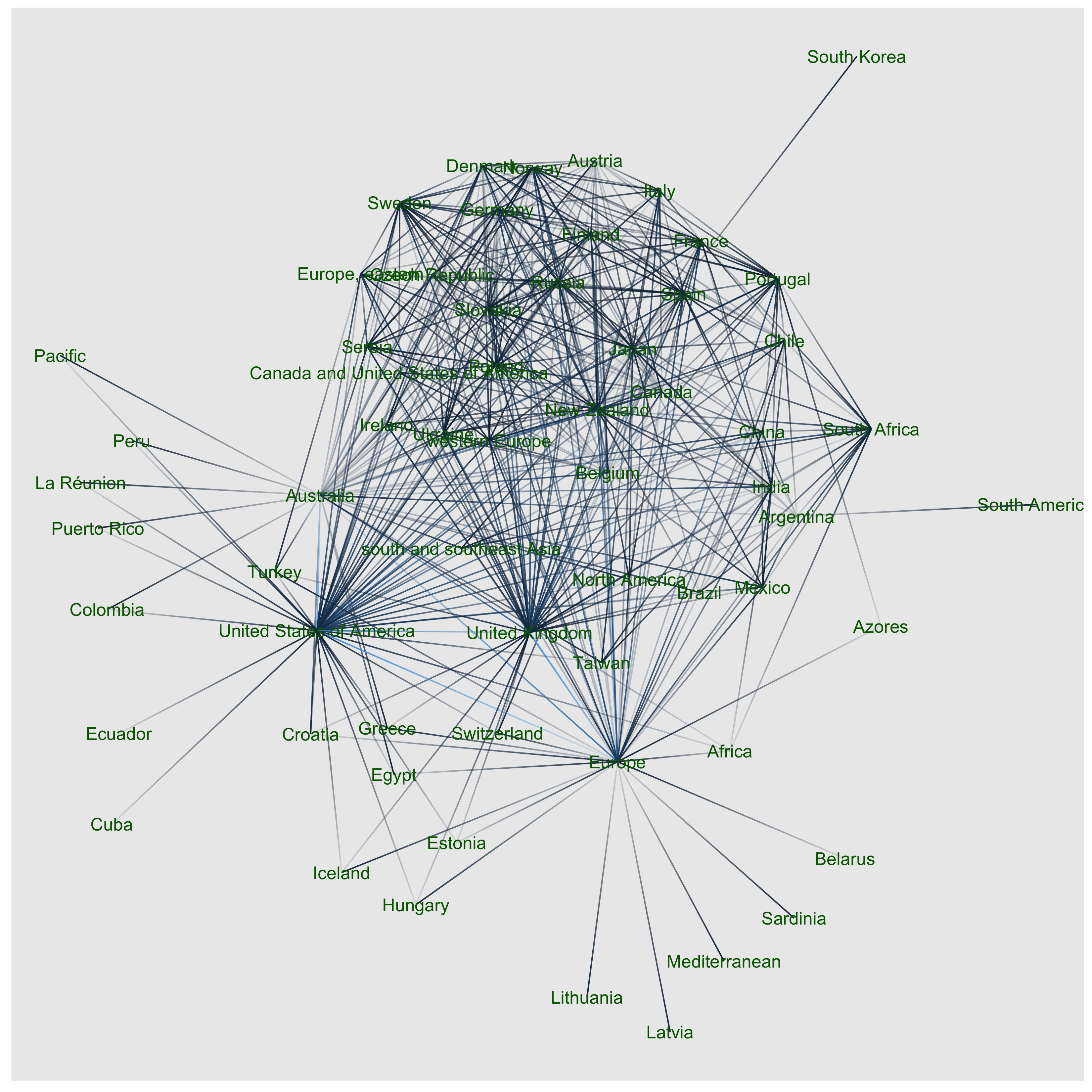
A co-occurrence network
news
code
analysis
weeds
network
This is a co-occurrence network I made from a weed species by geographic region list - an output from Rod Randall’s fantastic Global Weeds Compendium Randall (2017). This is not to be confused with CABI’s awesome Invasive Species Compendium (ISC). I contributed a few data sheets for their compendium a few years ago (Buddenhagen 2013a, b, 2014a, b, c, 2015, Buddenhagen 2016).

A pastoral weed horizon scan
news
research
weeds
horizon scan
This is my first post in a Quarto blog. Welcome! Here I share recent effort we made at AgResearch Ltd. via an interdisciplinary expert elicitation workshop to identify drivers of innovative weed research for the pastoral sector Buddenhagen et al. (2022). This builds on an earlier strategic more applied research document Bourdôt et al. (2018).
No matching items